
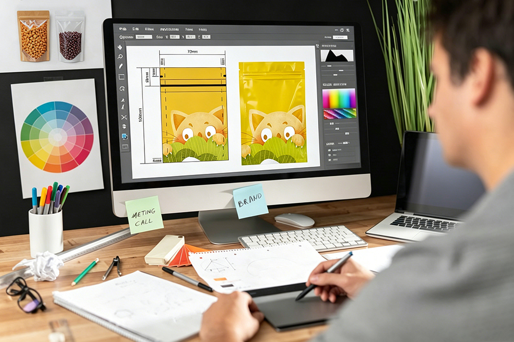
Designing for print is vastly different from designing for a screen. When it comes to custom flexible packaging, this gap is even wider. A design that looks stunning on a high-definition 3D rendering can suffer from misalignment, unreadable text, or seal distortion once printed on actual film.
For e-commerce brands and category leaders, packaging errors are costly—not just in terms of reprinting fees, but also in lost launch windows and damaged brand reputation.
To ensure your next packaging run is flawless, avoid these 5 common design mistakes when creating your custom pouches.
1. Ignoring the Seam and Gusset Areas (The “Disappearing Design” Trap)
Flexible pouches are 3D objects created by folding and sealing flat film. Stand-up pouches (SUP) and flat-bottom bags have gussets (side or bottom folds) and heat-seal seams.
- The Mistake: Placing critical branding elements, ingredients lists, or barcodes too close to the edge seals or within the bottom gusset.
- The Result: When the bag is filled with product and expands, these design elements fold underneath or get melted into the heat-seal seam, making them unreadable.
- The Fix: Always design strictly within the Safe Zone provided on your supplier’s die-line template. Keep crucial text and graphics at least 10mm away from all seal lines.
2. Low-Contrast and Reflective Barcodes (FBA’s Worst Nightmare)
If you sell on Amazon or plan to enter retail, your barcode (UPC or FNSKU) must be instantly scannable by high-speed laser scanners.
- The Mistake: Printing a glossy barcode on a reflective foil substrate, or using low-contrast color combinations (such as red on white, which laser scanners cannot read).
- The Result: Your inventory is rejected at the Amazon FBA warehouse, resulting in return fees and receiving delays.
- The Fix: Always print barcodes with dark ink (preferably black) on a solid white background. At Sunshine Packaging, we recommend choosing a matte finish overlay on the barcode area to eliminate glare and ensure a 100% scan rate.
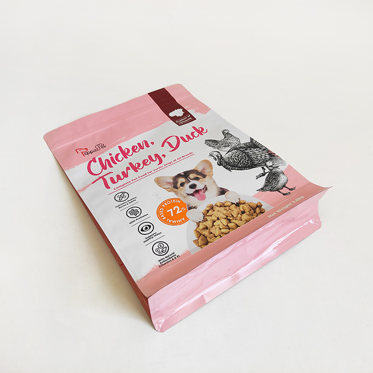
3. Misunderstanding Transparent “Windows”
Adding a clear window is a fantastic way to showcase your product (like pet treats or organic granola), but it requires careful technical design.
- The Mistake: Forgetting that the transparent area is created by leaving out the white ink backing layer.
- The Result: If you don’t specify the white plate correctly, the colors printed on top of the clear window area will look transparent, dull, and washed out once the dark product is placed inside the bag.
- The Fix: Ensure your designer creates a dedicated “White Ink” layer in the artwork file. This tells our pre-press team exactly where to apply the opaque white backing to make your brand colors pop, while keeping the window crystal clear.
4. Over-Complicating Gradients for Low-Tier Printing
Creating smooth color transitions and photorealistic gradients on flexible plastic films is incredibly challenging.
- The Mistake: Designing complex gradients with the expectation that a low-cost, uncertified factory can print them using outdated flexographic plates.
- The Result: The gradient looks “grainy,” has harsh color bands, or shows “ghosting” effects.
- The Fix: For high-end gradient work, you need rotogravure printing. Our BOBST™ 10-color electronic shaft printing lines provide the micro-precision registration required to achieve silky-smooth gradients and flawless photo reproduction, matching your brand’s digital presence perfectly.
5. Forgetting the “Eye-Mark”
An eye-mark is a small, solid rectangular block printed on the edge of the web film.
- The Mistake: Designers deleting the eye-mark from the artwork file because they think it’s a visual blemish.
- The Result: Our high-speed bag-making machines use laser sensors to read these eye-marks to know exactly where to cut and seal the film. Without it, the machine cannot align the front and back of the pouch, causing massive cutting errors.
- The Fix: Leave the technical eye-marks untouched on the die-line. Our pre-press engineers will ensure they are placed discreetly so they are folded into the seams and hidden from the consumer.
Conclusion: Flawless Prep Leads to Flawless Packaging
A successful packaging run begins long before the ink hits the film. At Sunshine Packaging™, we believe in “measure twice, cut once.” Our in-house pre-press team reviews every single artwork file to check for compliance, seal zones, and barcode scannability before manufacturing begins.
Combined with our Class 100,000 dust-free workshop and state-of-the-art BOBST technology, we guarantee that your physical custom flexible packaging will look even better than your digital 3D mockup.
Ready to start designing?